 →
→
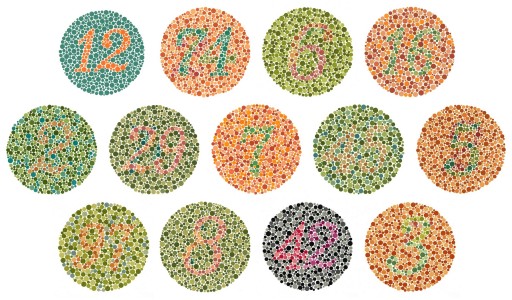
Deficiency:
This is an investigation in colour vision deficiency, also known as Daltonism or colour-blindness.
Below is a simulation of the four main types of colour vision deficiency:
→
Achromatopsia is the total or partial absence of colour vision. Here, I will use the term "achromatope" to refer to a person who only see shades of grey. Fewer that 1 in 30,000 of the population are achromatopes.
Protanopia is the lack of red retinal photoreceptors. Protanomaly is reduced sensivity to red. Here, I will use the term "protanope" to refer to a person with either protanopia or protanomaly and therefore has problems distinguishing between red and green. About 1 in 50 (2%) of the male population are protanopes, but only 1 in 2000 (0.05%) of females.
Deuteranopia is the lack of green retinal photoreceptors. Deuteranomaly is reduced sensivity to green. Here, I will use the term "deuteranope" to refer to a person with either deuteranopia or deuteranomaly and therefore also has problems distinguishing between red and green. About 1 in 17 (5.9%) of the male population are deuteranopes, but only 1 in 270 (0.37%) of females.
Tritanopia is the lack of blue retinal photoreceptors. Tritanomaly is reduced sensivity to blue. Here, I will use the term "tritanope" to refer to a person with either tritanopia or tritanomaly and therefore has problems distinguishing between blue and yellow. About 1 in 12,500 of the population are tritanopes.
Anything concerning colour-blindness is going to be subjective. To measure how "good" a palette is for colour-blind individuals we need the following:
For part one, I've chosen to use a corrected version of Color.Vision.Simulate from HCIRN. This takes an RGB triplet and remaps it to another RGB triplet to simulate the colour deficiency. For a "normal" palette, we can generate corresponsing "protanope", "deuteranope", "tritanope" and "achromatope" palettes.
For part two, I use CIEDE2000, also known as ΔE2000. This may not be the most appropriate metric for CVD analysis, but it's well-defined and already part of my Goldenrod library.
For part three, we just find the minimum ΔE2000 distance between pairs of colours in the palette and call it "min ΔE2000".
For part four, we need a few more metrics for each unmapped and/or remapped palette:
We then define the following scores:
Note that as the number of entries in a palette increases, we expect the λ, β, α and ω scores to decrease.
In general, for our purposes, a "good" palette is one with high λ, β and/or α scores. Maximising λ is appropriate for about 92% of the population; β for about 8%; and α for less than 0.01%. We define a "CVD-safe" palette as one with high λ, β and α scores.
The 'Chilliant' palettes below have been found using a combination of solvers, exhaustive searches and heuristics. I have been unable to come up with a single solution as the size of the search-space is enormous. For a six-colour palette there are 3×1040 colour combinations.
The simplest CVD-safe palette is one made up of just black and white:
As an aside, the two-colour palette with the greatest lambda I could find was this navy/lime pair:
If we add a mid-point grey to Monochrome, we get a three-colour greyscale:
But that isn't the best three-colour CVD-safe palette I found; this is:
If we just limit ourselves to primary additive colours, we can clearly see the red-green confusion of protanopes and deuteranopes:
The classic 16-entry CGA palette is definitely not CVD-safe:
Note that for "paired" palettes, we don't include distances between pairs when calculating metrics. For example, above, even though light and dark red are only 10° apart in CIE LChab space, we don't include that value in the computation of "min Δhab".
The Sinclair ZX Spectrum fares a bit better, possibly because it was a budget home computer and therefore more likely to be used with a black-and-white television, where colours were displayed as a fairly uniform greyscale ramp. This greatly helps its alpha score. However, the vagaries of the RF modulator, PAL signals and your actual CRT television mean that these figures should be taken with a pinch of Sinclair salt!
A different type of hardware palette is the electronic colour code used for components:
The real-world results depend greatly on the colorimetric properties of the paints used, the lighting conditions and the eyesight of the engineer.
Dividing the HSL colour wheel into six segments and using full saturation and 50% lightness:
To many people, using the HSL colour wheel like that is considered "harmful". They may promote using a perception-oriented colour model like CIE LChab, but this can actually lead to worse palettes for people with CVD unless care is taken. Consider the following CIE LChab colour wheel with lightness and chroma fixed to the maximum shared values (75 and 39 respectively):
Although omega has improved, beta and alpha have plummeted.
The following palettes have the following properties:
Note that 'Chilliant Pale 9' and 'Chilliant Deep 9' below are also equally-spaced around the CIE LChab colour wheel.
David Nichols has a good page on CVD-safe palettes and lists examples from IBM, Wong and Tol.
Amazingly, the IBM Color Blind Safe palette scores zero for alpha. This is because "ultramarine 40" and "orange 40" are the same lightness. Omega is very low because the hues are clumped together at the top of the colour wheel. It doesn't score particularly highly for lambda or beta, either.
Here's an "improved"" five-colour palette with a similar Lab lightness range:
Bang Wong's palette is optimised for protanopes and deuteranopes and includes black. It scores poorly on omega (hue separation) because "sky blue" and "blue" are close together on the colour wheel.
Here's an alternative version of 'Wong' with similar ranges of lightness but better scores all round, particularly for achromatopes.
Paul Tol's colours schemes are systematic and well thought out. Most of them are limited to near-web-safe colours, which is another nice feature.
Tol's "Bright" qualitative scheme is optimised for red-green colour-blindness:
Tol's "High-Contrast" qualitative scheme scores well for alpha, as one would hope:
Tol's "Vibrant" qualitative scheme scores well for beta and alpha:
Tol's "Muted" qualitative scheme is desaturated. It scores well for such a large palette:
Tol's "Medium-Contrast" qualitative scheme is a paired variation of his "High-Contrast" scheme:
Tol's "Pale/Dark" qualitative scheme is a paired palette designed for text labelling:
Tol's "Light" qualitative scheme is designed for a larger number of data categories but with a small Lab range:
Consider Tol's "Muted" qualitative scheme without the grey:
If we relax the near-web-safe restriction, we can improve those scores (though not substantially) by tweaking values within the existing CIE LChab ranges:
In addition to the 'Chilliant' palettes mentioned above, here are some CVD-safe palettes I found during my investigations.
The following colours are almost equally-spaced around the CIE LChab colour wheel and in ascending Lab lightness from 55 to 85. The palette works well with black (#000), grey (#777) and white (#FFF).
The following colours are fairly equally-spaced around the CIE LChab colour wheel and in ascending Lab lightness from 16 to 46. The palette works well with black (#000), grey (#777) and white (#FFF).
We can join the two palettes above with grey to create a large CVD-safe palette of 19 colours:
One issue with 'Chilliant Dark/Light 19' is the lack of pairing of colours that work together in the way that 'Tol Pale/Dark Qualitative' does. If we extend the Lab lightness range slightly from 16…85 to 10…90, we can pair the entries by using shared, equally-spaced hab hues. First, the pale colours:
Second, the deep colours with the same hab hues and Cab chromas:
Finally, we can join the two palettes with grey (#777) to create a large CVD-safe paired palette of 19 colours:
We can use the same technique to find CVD-safe paired palettes of different sizes:
'Chilliant Dual Dark' palettes omit the grey mid-point and are a little darker than their 'Chilliant Pale/Deep' counterparts. Because of their compressed Lab lightness ranges, they are slightly inferior in terms of β and α:
If we relax the constraint of having the hab hues equally-spaced, we can obtain unpaired palettes that are particularly good for colour-blind observers. However, they can appear quite jarring for people with "normal" vision, so should probably be limited to qualitative categorisation. The following palettes have equally-spaced Lab lightness between 20 and 80 (maximising α):
The following charts plot the palettes in CIE LChab polar colour space. The clockwise angle is the hue hab and the distance from the centre is the Lab lightness. Cab chroma plays not part except to cull black/grey/white points.
Here's a summary of the palettes with the colours sorted by :
| Palette | N | λ | β | α | ω | Colours |
|---|---|---|---|---|---|---|